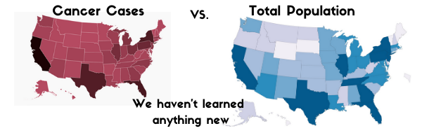
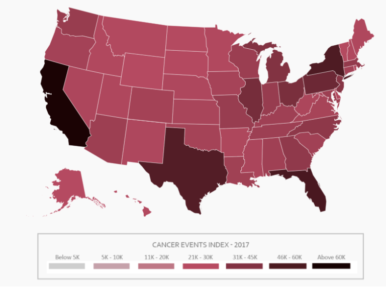
I can immediately see that California, Texas, Florida, and New York have the highest number of cases. But since I’ve looked at a lot of data maps in my life, I also noticed something else. The first map looks an awful lot like this map:
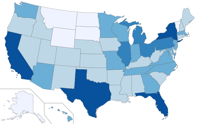
How can they be so similar? Are they showing the same thing? Essentially. This second map shows total population by state. No matter what data element that first map was trying to show, as long as it was total counts of something to do with people, the map will always basically just show the relative populations of each state. Think about it – the more people you have, the more of X people-related thing you will always have. I could caption this map as number of dog or cat owners, number of Star Wars fans, number of people who dress up like Batman – as the number of total people goes up so will all these things.
Now, you may be thinking, “But where you live could totally affect these things!” And yes, it certainly could. But unless it affects it to a massive order of magnitude, as in millions more occur in some states and not at all in others, you won’t be able to see it over the much stronger relationship to straight population numbers. That’s why it’s much better to show geographic counts as per population rates: Batman-wearing fanatics per 10,000 state residents, for example. Then any influence location might have will be much more obvious.
If you want to get serious about it, any time you are comparing distinct populations you should consider creating a standard population measure adjusted for any key characteristics that might impact your measure. For example, in the cancer event case, we know that people are more likely to get cancer as they age. That means in addition to adjusting for differences in total population, we may also want to adjust for differences in number of people of different ages across the states. Here’s a great walk-though on how to do this.
There are certainly times when you want see actual counts For example, trying to pick a place for a new store – you probably care about the total number of possible customers, not just the rate of customers. But much of the time we see total counts even when a rate would be a better measure. Especially when we’re looking at groups that have such dramatically different population sizes as our states – we don’t really learn anything new from these maps.
